import pandas as pdDataframes
The pandas module is a powerful tool for data manipulation and analysis. Pandas allows for the import and export of data in several standard formats such as comma-separatped values (.csv) and Microsoft Excel (.xls). If you are working with spreadsheets for data handling and would benefit from automatized ways to merge, reshape, select, clean, wrangle, plot, etc. your data, then you are likely to benefit from pandas.
Create dataframe from spreadsheet
The most important class in pandas is DataFrame. An object of this class corresponds to a sheet in an Excel file. A dataframe can be constructed with the method read.excel:
pd.read_excel("path_to_file.xls", sheet_name="Sheet1")Create dataframe from Python dictionary
Dataframes can also be thought of as Python dictionaries and we can also create a dataframe from a Python dictonary.
results = {"Name": ["Alice", "Ceasar", "David", "Beatrice"], "Result": [33, 25, 18, 22]}

# create dataframe
df = pd.DataFrame(results)

# display the 5 first lines
df.head(5)Manipulate data
We can sort the dataframe by a certain column.
df.sort_values(by="Name", ascending=True)Analyse data
We can list a selection of elements in the dataframe, say those students that passed the examination point limit.
df[df["Result"] > 20]We can perform statistical anlyses on the dataframe.
print("Averaged result is equal to", df["Result"].mean(), "points.")Averaged result is equal to 24.5 points.
df["Result"].describe()count 4.000000
mean 24.500000
std 6.350853
min 18.000000
25% 21.000000
50% 23.500000
75% 27.000000
max 33.000000
Name: Result, dtype: float64Plot data
We can plot the data in the dataframe. Pandas has built-in dataframe plot functionality using matplotlib as the underlying plot engine, so you can also import matplotlib.pyplot for additional plot control.
import matplotlib.pyplot as plt

df.plot(x="Name", y="Result", kind="bar", ylabel="Points on exam")

plt.setp(plt.gca(), xticklabels=list(df["Name"]))
plt.axhline(20, color="lightgrey")
plt.show()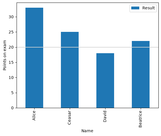
Data analysis
Data analysis and open data
Data analysis is the process of inspecting, cleansing, transforming, and modeling data with the goal of discovering useful information. As part of the field of data science, data analysis is today of paramount importance in life sciences as can be no better exemplified than by the scientific discoveries enabled by the Human Genome Project and the Human Protein Atlas.
Alongside this data revolution, there is the growing idea of open data, which is the idea that some data should be freely available to everyone to use and republish as they wish, without restrictions from copyright, patents or other mechanisms of control. Today, it is a common practice to make data from government-funded research available in this way and the number of open and curated datasets is growing at a fast and accelerated rate. Perform a search for “open datasets” on the internet and the response is overwhelming, which can make navigation difficult.
UNICEF malaria datasets
As a simple illustration of data analysis, we will study the UNICEF datasets on malaria.
import matplotlib.pyplot as plt
import pandas as pd

pd.set_option("display.max_columns", 50)
These particular datasets can be freely downloaded in the form of a single Excel file with multpile spreadsheets, and we will look at two of these sheets.
Diarrhoea care dataset
The first sheet collects the percentages of children under the age of five years who have had diarrhoea in the two weeks preceding the survey for whom advice or treatment was sought from a health facility or provider.
We load this sheet into a pandas DataFrame, leaving out the first five rows of description that precede the actual data. Column “A” is empty in the spreadsheet and is therefore also left out in the import process.
df_dc = pd.read_excel(
    "../data_input/Child-Health-Coverage-Database-July-2021.xlsx",
    sheet_name="DiarCare",
    skiprows=[0, 1, 2, 3, 4],
    usecols="B:V",
)
Getting to know your dataset
At this point, you should start by getting to know your dataset. In a Jupyter notebook environment, a nice printout of the dataframe is provided by just typing its name and running the code cell. Some datasets can be very large and you may first wish to print out the shape attribute of the dataframe.
df_dc.shape(354, 21)We see that this dataframe contains 354 surveys collecting information and data in 21 colunms. Next, let us print out the column headers and the first five rows of the dataframe with use of the head method.
df_dc.head(5)Afghanistan is the first listed country and we can see that three surveys have been performed during the years of 2011, 2015, and 2018. An overviewing statistics of the dataset is provided with the describe method.
df_dc.describe()It becomes immediately clear that, among other noticeable things, the illness affects equally children of different gender.
A histogram plot more clearly shows the dire severity of the situation.
df_dc["National"].hist(bins=range(0, 101, 10))

plt.ylabel("Number of country surveys")
plt.xlabel("Percentages of children seeking diarrhoea care")

plt.show()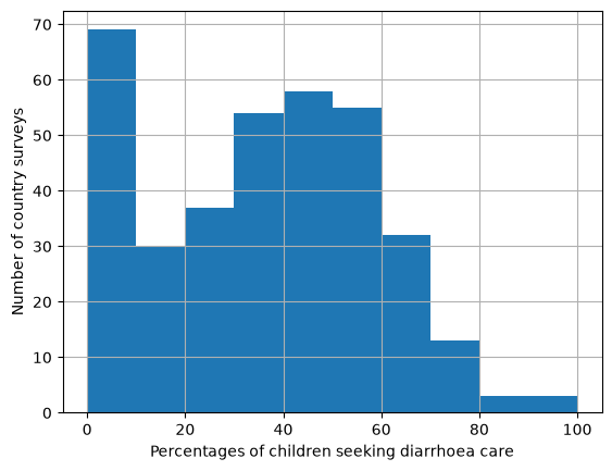
Use of insecticide-treated mosquito nets
The second dataset that we will investigate collects information about the use of insecticide-treated mosquito nets (ITNs). The percentages of children under the age of five years who slept under a ITNs the night prior to the survey are given.
df_itn = pd.read_excel(
    "../data_input/Child-Health-Coverage-Database-July-2021.xlsx",
    sheet_name="ITN",
    skiprows=[0, 1, 2, 3, 4],
    usecols="B:S",
)
Getting to know your dataset
We perform the same overview also of this second dataset.
df_itn.head(5)df_itn.describe()df_itn["National"].hist(bins=range(0, 101, 10))
plt.ylabel("Number of country surveys")
plt.xlabel("Percentage of children sleeping under ITNs")
plt.show()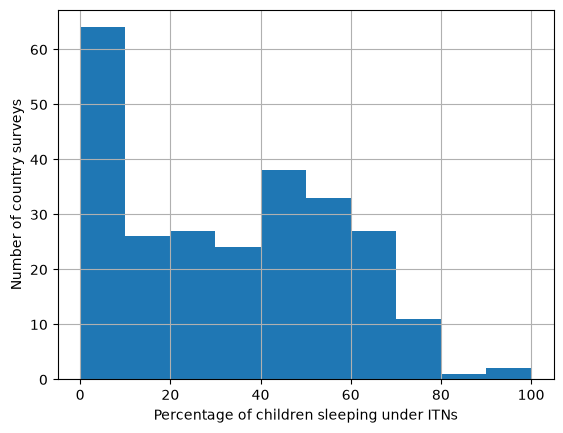
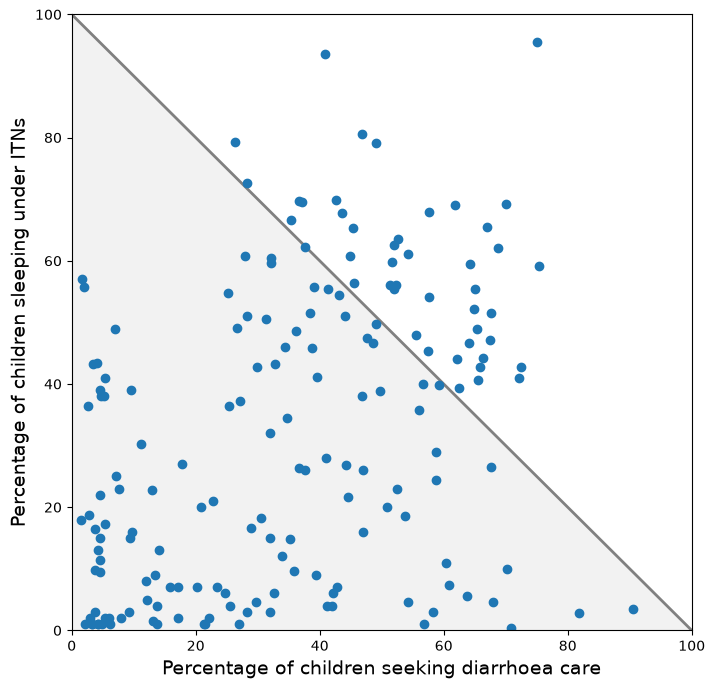
Dataset correlation analysis
If we were to set up a model for the spread of malaria, it would be reasonable to introduce the percentage use of ITNs among the population as a parameter. Our intuition tells us that the use of ITNs lowers the spread of malaria such that it consequently reduces the cases of children seeking help for diarrhoea. But it would be valuable to put this hypothesis to test against real data and also to get an idea about the strength of this coupling and thereby set a value on the corresponding parameter.
From a technical point of view, it can be less than straightforward to interrelate informaion from different datasets. For example, in this particular case, we must consider the fact that the two datasets contain different surveys that only partly overlap and it becomes necessary to perform a data matching to extract any useful information. This represents a situation where pandas shows it strength compared to a conventional spreadsheet data analysis.
Let us do the following:
Iterate over all surveys in the diarrhoea care (DC) dataset and extract information about the
countryandsource(unique identifier of the survey).Iterate over all
countrysurveys in the insecticide-treated mosquito net (ITN) dataset.If there is a match for
source, then save the pair of DC and ITN data points for national averages.Plot the data points to see if a correlation is visible.
# collect comparable data into lists
data_dc = []
data_itn = []

for idx_dc, row_dc in df_dc.iterrows():

    country = row_dc["ISO"]
    source = row_dc["Short Source"]

    for idx_itn, row_itn in df_itn[df_itn["ISO"] == country].iterrows():

        if row_itn["Short Source"] == source:

            data_dc.append(row_dc["National"])
            data_itn.append(row_itn["National"])
fig = plt.figure(figsize=(8, 8))
ax = plt.axes(xlim=(0, 100), ylim=(0, 100))
plt.plot([0, 100], [100, 0], "-", color="grey", lw=2)
plt.fill_between([0, 100], [100, 0], alpha=0.10, color="grey")
plt.plot(data_dc, data_itn, "o")
plt.ylabel("Percentage of children sleeping under ITNs", size=14)
plt.xlabel("Percentage of children seeking diarrhoea care", size=14)
plt.show()